One of my absolute favorite projects every year is designing for the Western Idaho Fair. It’s a big push to design a whole campaign top to bottom, but this year was HUGE! Not only were we creating a yearly campaign, but we were also launching the brand-new Western Idaho Fair brand design. That meant thinking even bigger picture and creating rules to hang this and all foreseeable designs on.
See how we did it.
Old to New
1. Starting with the Logo
The Western Idaho Fair logo was overdue for an update, it had been this logo for as long and I can remember. We wanted to modernize it and give it a bit of that fun and whimsy that going to the fair feels like. The new logo also needed to feel like Idaho, celebrate all aspects of the fair, and work well with the updated Expo Idaho branding, which we had created just a couple of months earlier.
Some of the things we knew about the Western Idaho Fair brand:
- It’s a family-friendly event that hits right at the peak of summer
- Excitement, joy, and fun are key to keeping the brand authentic
- The space will gain a new park in the very near future
- It is a temporary use of the space, with the Expo being the event space year-round
- It wanted to highlight agriculture, which tends to get overlooked for the carnival and entertainment
2. The First Pass
As a team, we really threw everything at the wall. In my opinion, this is the best part of concepting, it’s just about getting what’s in your head onto paper and seeing if it resonates with everyone else. We all took the brief in very different ways, and coming together after our first pass was fun to see where our creative minds took us.
3. Refining
After selecting a handful to take to client and receiving their notes we worked on revising the more promising designs. With a wish for the state of Idaho to be in the design somewhere, I played with several layouts where Idaho looked like a continuation of the simplified rollercoaster, but it felt too crowded and the harsh corners of our state didn’t quite flow with the other, more simplified design elements.
While in this process, I took a look back on some of our older designs, which inspired me to try using Idaho as a cutout in one of the letters. In the beginning, I was set on adding it to the A in Idaho, but pairing the visual with the word seemed redundant.
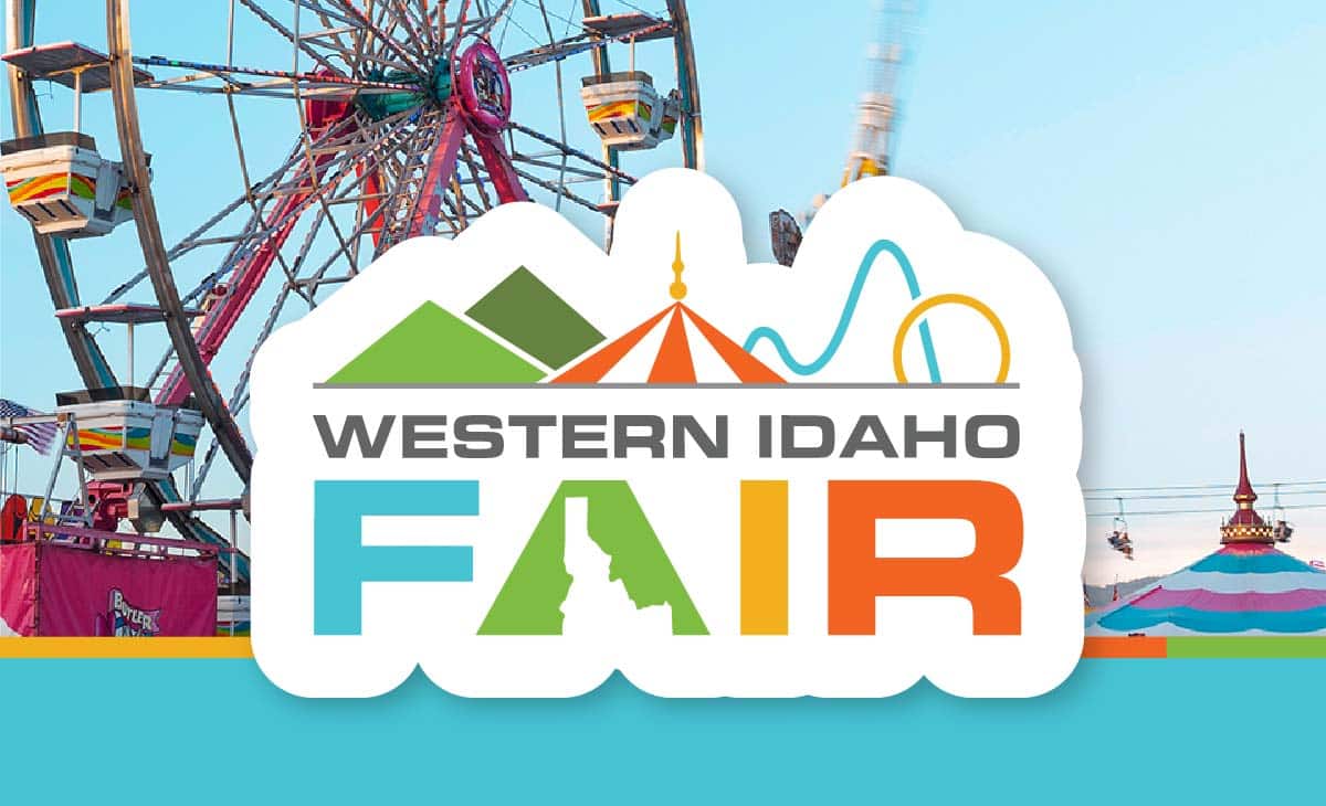
4. The Final Logo
We landed on making “Fair” the focus of the logo and embedding the visual Idaho within the letter A. By doing this, the logo layout became far more flexible. “Western Idaho” could be there, or if we needed a particularly small version of the logo, we could omit that line entirely, and the message that this was Idaho’s Fair would still be communicated. Our final logo layout was then accompanied by two more abbreviated designs. A more condensed version of “Western Idaho Fair” where we took out the mountains in the icon header and made the design a bit more of a stacked square, and then just the “Fair” version that stacked the roller coaster behind the big top tent.
5. Bringing In Color
Early on, we knew the color palette for the Fair would also need to sit nicely with the Expo Idaho palette, which we had already set. The Expo color palette was chosen to reflect the feeling of discovery and excitement. We wanted the colors to feel primary but also natural, as the new “Park at Expo Idaho” was about to break ground. Knowing the reasoning behind the color choices helped to narrow down the possible palettes for the Fair.
Inspiration: the new Expo Idaho color palette
In reevaluating the project brief, the idea that the Fair logo needed to sit well with the Expo logo stood out. What if the Fair colors felt like a bright summer day version of the Expo colors? The Expo needed to work for all seasons, but the ephemeral nature of the Fair meant that we could embrace those warm and invigorating colors that feel like the perfect summer day. Bright blue sky, fresh green grass, golden sunlight, and that vivid red orange of turning your closed eyes up towards the sun. All these colors gave the energy and heat of exploring the countryside with the perfect lunch packed for later, on a sun-drenched grassy hillside.
The final Western Idaho Fair color palette (with Expo Idaho color palette)
6: From Logo to Real Life
Now that we had a logo, it was time to create rules for how to deploy it into the real world. So, when you do attend the Western Idaho Fair, here are some design rules to look for when spotting the design in the wild.
RULE 1: A SUMMER DAY AESTHETIC
Where possible, the design layout will embrace the summer day aesthetic, i.e., Blue sky and green hills.
Call it a bit of a Studio Ghibli inspiration, they really know how to make a summer day look so inviting. This has been my way of projecting that same warmth and sense of adventure into certain areas of the fairgrounds. You can spot this rule most prominently in the Front Gate banners. the Wayfinding Grounds pole signs, and the Animal Department banners in the barns.
RULE 2: KEEP IT SIMPLIFIED
All additional artwork will be designed in the same simplified style at the icon header from the logo.
You saw some of this in the examples from the first rule. I needed to create a whole barnyard of animals to populate the Animal Department banners, and on top of that, we also needed some classic fair food and entertainment imagery. All of these were created as flat shapes with visually efficient details. The discerning eye can catch this rule in action on the Grounds pole signs, a portion of the Parking Lot pole signs, the Animal Department banners in the barns, as well as the Expo Buildings Above Door signs, and the Competitive Department banners.
RULE 3: EMBRACE THE RAINBOW
All four of the main colors may not be your classic rainbow, but they can bring the same excitement when used in tandem.
Using these colors to call out different elements or events at the fair can help visually brand a subsection of the fair. This is most aptly used when I designed the Concert materials. The poster matched the tickets, which matched the VIP badges and box seat table tents. Each concert was branded with its own color, so with a quick glance, you would know what concert was happening each night.
You can also find the full brand rainbow in use at the Vendor Expo for the Aisle banners, the Ag photo backdrops, and the Fair Staff shirts. Also previously seen in the Parking Lot pole signs, and the Competitive Department banners.
So, what do you think? How did we do branding the space and giving the Western Idaho Fair a fresh new style? Have you been to the Fair to see how it looks for yourself? Come on out! The Fair is running through Sunday, August 24th, and you can see the new brand in action! If you’re interested in rebranding or other creative services, contact us.